
| 일 | 월 | 화 | 수 | 목 | 금 | 토 |
|---|---|---|---|---|---|---|
| 1 | 2 | 3 | 4 | 5 | ||
| 6 | 7 | 8 | 9 | 10 | 11 | 12 |
| 13 | 14 | 15 | 16 | 17 | 18 | 19 |
| 20 | 21 | 22 | 23 | 24 | 25 | 26 |
| 27 | 28 | 29 | 30 |
- 리버싱
- 리틀엔디언
- 프론트엔드 개발자
- sa 계정 비밀번호 변경
- 배열 정렬
- 암호화폐
- 알고리즘
- 네트워크 관리사 2급 필기
- 배열 탐색
- C언어
- abex crack me 2번 문제풀이
- 안드로이드 백도어
- abex crack me 1번
- 배열
- 덧셈
- UDP daytime
- c언어 알고리즘
- abex crack me 5번문제
- 빅엔디언
- 재밌는 모바일게임
- 1.9.2
- 메이플스토리 M 사전예약
- react native
- 구조체 함수
- 프로그래밍 언어론
- 마인크래프트
- 레나 리버싱
- 오버워치
- Reverse Me
- 구조체
- Today
- Total
Gyejoong's Information
Gatsby 빠르게 시작해보기 본문
안녕하세요. 최근에 Gatsby를 공부할겸 포트폴리오 사이트를 만들어보기 위해 해당 포스팅을 작성하게 되었습니다.
Gatsby란?
Gatsby는 React 기반의 오픈소스 프레임워크 이며, 정적 웹사이트를 만들때 빠르게 만들 수 있습니다.
Gatsby를 사용하기 좋은 케이스
Gatsby는 React기반인데, 왜 별도의 툴이 존재할까 라는 생각이 들기도 합니다.
하지만, Gatsby는 다음과 같은 상황에서 확실하게 장점으로 작용됩니다.
- 별도의 서버 없이 운영하고 싶은 경우
- React를 사용하여 정적 사이트를 만들고 싶지만, SEO (검색엔진 최적화)가 문제가 되는경우
아무래도 React 기반이기 때문에 React의 사전지식이 필요하며, GraphQL를 사용하므로 해당 관련 지식이 필요 할 수 있습니다.
해당 관련 지식에 대한 경험이 부족하다면 아래 링크를 통하여 간단하게 살펴보고 오시면 됩니다.
사전지식
리액트와 GraphQL에 대해서 어느정도 파악 하셨다면, 실전으로 투입할 차례입니다.
우선 Gatsby를 사용하기 위해선, Gatsby CLI 도구를 설치해야 합니다.
Gastby CLI 설치하기
npm install -g gatsby-cli
or
yarn global add gatsby-cli
위 명령어로 설치하게 되면, 로컬의 Global 환경에 설치가 됩니다.
따라서, shell의 어떤 곳에서든지 해당 Gatsby CLI를 실행할 수 가 있습니다.
이제 다음으로, Site를 한번 만들어 봅시다.
새로운 사이트 생성하기
gatsby new gatsby-site위 명령어를 실행하면 package manager를 선택하라고 나오는데, npm과 yarn중에서 선택하시면 됩니다.
생성한 폴더로 이동하기
cd gatsby-site디렉토리 구조
public/
- 정적 파일이 담겨 있는 폴더 입니다.
src/
- 실제 소스코드가 있는 폴더이며, 기본 구조는
components,images,pages3개의 폴더로
이루어져 있습니다. 리액트 기반 이므로 리액트를 개발할때와 유사하게 디렉토리 구조를 구성할 수 있습니다.
gatsby-browser.js
- 브라우저의 API를 사용하고 싶을 때 해당 파일에서 구현합니다.
gatsby-config.js
- 메타 데이터 속성 및 Gatsby의 설정들을 관리합니다.
gatsby-node.js
- Node.js 환경의 API를 구현하기 위해 관리되는 파일입니다.
gatsby-ssr.js
- Server Side Rendering API를 구현하기 위해 관리되는 파일입니다.
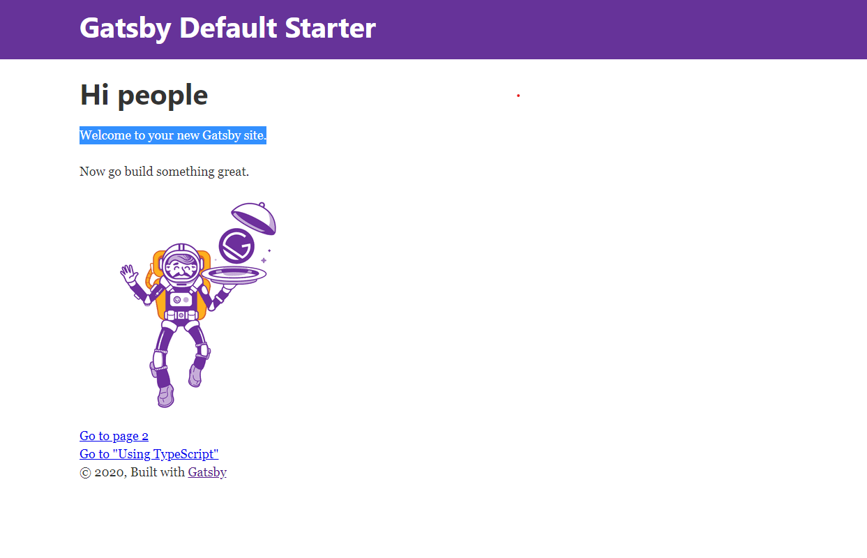
개발서버 시작하기
gatsby develop개발 서버를 시작하면, 아래와 같은 기본 샘플 구조 형태를 가진 사이트가 렌더링 됩니다.
레이아웃 구조 잡아보기
아래 이미지는 구성할 레이아웃 입니다.
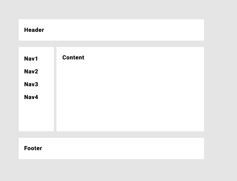
크게 4개의 영역을 잡았고, 각각이 컴포넌트가 되도록 구성할 수 있습니다.
우선 작업할 컴포넌트는 4개입니다.
/src
  /components
    Header.js
    Navigation.js
    MainContent.js
    Footer.js
실제 구현을 하기전에, 개발환경을 구성합니다.
개인적으로 css in js 방식을 선호하며, 관련 라이브러리인 styled-components를 사용하여 진행하겠습니다.
yarn add styled-componentsVSCode 환경에서 개발한다면, styled-components의 호환을 맞추기 위해 Extension을 설치하면 편합니다.

다음은 소스코드 입니다.
Header.js
import PropTypes from 'prop-types';
import React from 'react';
import styled from 'styled-components';

const Header = ({ siteTitle }) => (
  <Style>
    <div className="title-wrapper">
      <h1>{siteTitle}</h1>
    </div>
  </Style>
);

const Style = styled.header`
  width: 100%;
  height: 64px;
  background-color: #fff;

  .title-wrapper {
    max-width: 960px;
    margin: 0 auto;
    padding: 0.3rem 1.0875rem 1.45rem;
  }
`;

Header.propTypes = {
  siteTitle: PropTypes.string,
};

Header.defaultProps = {
  siteTitle: ``,
};

export default Header;
Navigation.js
import React from 'react';
import styled from 'styled-components';

const Navigiation = () => {
  const contents = [
    {
      id: 1,
      name: 'Navigation 1',
    },
    {
      id: 2,
      name: 'Navigation 2',
    },
    {
      id: 3,
      name: 'Navigation 3',
    },
    {
      id: 4,
      name: 'Navigation 4',
    },
  ];

  return (
    <Block>
      {contents.map((content) => (
        <p key={content.id}>{content.name}</p>
      ))}
    </Block>
  );
};

const Block = styled.div`
  width: 180px;
  display: flex;
  flex-direction: column;
  background-color: #fff;
  padding: 12px;

  p {
    font-size: 18px;
    font-weight: bold;
  }
`;

export default Navigiation;
MainContent.js
import React from 'react';
import PropTypes from 'prop-types';
import styled from 'styled-components';

const MainContent = ({ children }) => {
  return <Style>{children}</Style>;
};

const Style = styled.div`
  width: 100%;
  background-color: #fff;
  margin-left: 24px;
  padding: 12px;
`;

MainContent.propTypes = {
  children: PropTypes.node.isRequired,
};

export default MainContent;
Footer.js
import React from 'react';

import styled from 'styled-components';

const Footer = () => {
  return (
    <Style>
      <span>© 2020.07. By ...</span>
      <code>
        Powered by <a href="">...</a>
      </code>
    </Style>
  );
};

const Style = styled.footer`
  width: 100%;
  height: 64px;
  background-color: #fff;
  display: flex;
  align-items: center;
  justify-content: center;
  flex-direction: column;

  span {
    font-size: 14px;
  }

  code {
    font-size: 12px;
    background-color: #ccc;
    padding: 2px;
    margin: 4px;
    border-radius: 4px;
  }
`;

export default Footer;
Layout.js
import React from 'react';
import PropTypes from 'prop-types';
import styled from 'styled-components';

import Header from './Header';
import Navigation from './Navigation';
import MainContent from './MainContent';
import Footer from './Footer';

const Layout = ({ children }) => {
  return (
    <Style>
      <Header siteTitle="Header" />
      <MainStyle>
        <Navigation />
        <MainContent>{children}</MainContent>
      </MainStyle>
      <Footer />
    </Style>
  );
};

const Style = styled.div`
  width: 100%;
  height: 100%;
  background-color: #999;
`;

const MainStyle = styled.main`
  width: 100%;
  height: calc(100% - 176px);
  display: flex;
  margin: 24px 0 24px 0;
`;

Layout.propTypes = {
  children: PropTypes.node.isRequired,
};

export default Layout;
index.js
import React from 'react';

import './index.css';

import Layout from '../components/layout';
import SEO from '../components/seo';

const IndexPage = () => (
  <Layout>
    <SEO title="Home" />
    <h1>Content</h1>
  </Layout>
);

export default IndexPage;
index.css
html,
body,
#___gatsby,
#gatsby-focus-wrapper {
  height: 100%;
}

* {
  margin: 0;
  padding: 0;
  box-sizing: border-box;
}
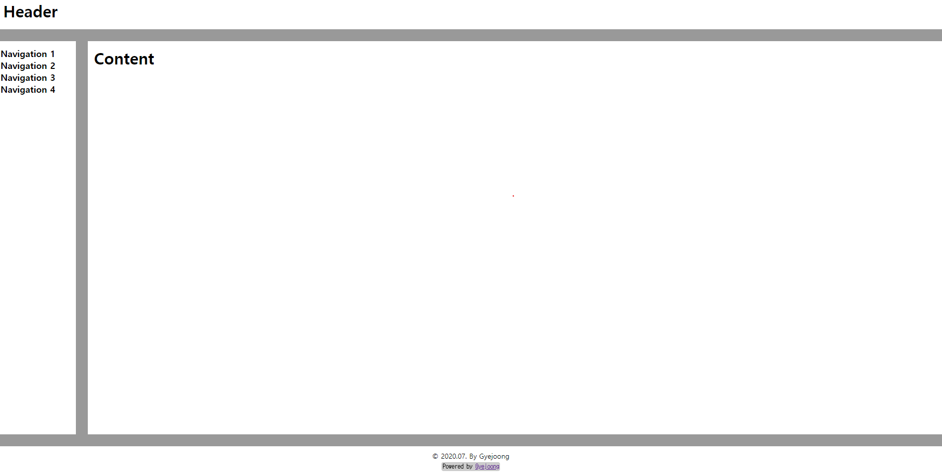
위와 같이 작업하게 되면, 아래와 같이 결과가 나오게 됩니다.
마치며...
Gatsby를 활용하여 간단한 레이아웃을 만들어 보았는데요. 개발 환경에서는 React와 동일하게 CSR 방식으로
렌더링 되지만, 실제 배포시에는 마크업을 빌드 과정에서 만들어서 배포되기 때문에 차후 SEO 문제를 해결 할 수 있습니다.
기존 React를 사용하면서, 간단하게 홈페이지나, 블로그, CMS와 같은 웹페이지를 SEO 문제를 해결 하고 싶다면Gatsby를 활용해보는건 어떨까요?